Great fonts (also known as typography) in eLearning design can make your course content alive, thus boosting learning results. Having these in mind, here is a list of 6 easy-peasy rules that you can check when working with fonts.
In the pursuit of effective eLearning, accessibility and professionalism are non-negotiable. The fonts you choose play a critical role in both. Selecting legible and appropriately sized typefaces ensures that your content is accessible to all learners, regardless of visual abilities. Furthermore, a well-considered font palette contributes to the overall credibility and polish of your online courses, reflecting a commitment to quality learning experiences.
For eLearning developers seeking a comprehensive solution that allows for careful font selection and consistent application across projects, ActivePresenter, one of the best eLearning authoring tools, offers the features necessary to achieve both accessibility and a professional aesthetic.

So, what is the proper use of fonts in eLearning design to build good-looking courses? Let’s explore the 6 following checks:
- Know the Different Font Types
- Choose the Legible Fonts for eLearning
- Create Hierarchy with Font size, Contrast, & Line Spacing
- Avoid Unnecessary Font Emphasis
- Minimize the Number of eLearning Fonts Used
- Notice New Fonts Embedding in eLearning Courses
Know the Different Font Types
As you may already know, using fonts is simply the way to display texts on a page or slide. In general, the classification of fonts comes with 4 main types. They are serif, sans-serif, script, and decorative fonts.
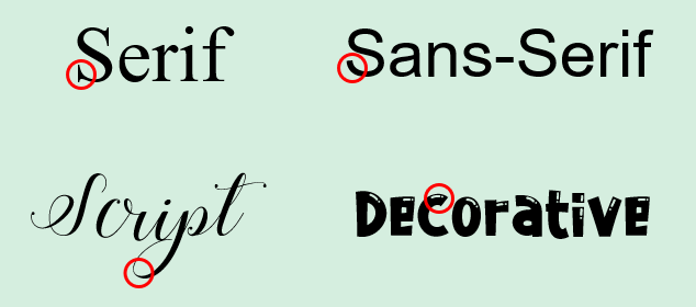
- Serif fonts include short lines on the edge of the letters. Examples are Times New Roman, Georgia, or Garamond. This type of font gives a traditional and formal impression. It is also best suited in printed format as newspapers or books.
- Sans-serif fonts have no such short lines as the Serif fonts do. Some fonts of this type can be Arial, Open Sans, Calibri, Roboto, and more. They have a more modern look and give a more easy-to-read experience on screen uses.
- Script fonts mimic handwriting style. Open Sans and Segoe Print are two examples of this font type. They benefit your text with a sense of elegance and sophistication. However, using the script fonts in the whole body text is a poor choice, but maybe good for emphasis.
- Decorative fonts are out of the above font types. They are informal and diverse, but hard to read. So, you should use them sparingly and only as an artistic element.
Choose the Legible Fonts for eLearning
In short, the 4 font types above can meet different purposes of conveying text information. Among them, the Sans-serif is considered the best font for learners to read in eLearning courses. That’s because it relies on font legibility in eLearning typography. That is to say, legibility relates to the distinction of one letter from another within a font. Good legibility means the letters are clear and easy to read. Therefore, learners can read text quicker. For example, Arial is one of the most popular eLearning fonts as it can display well on different digital devices. Moreover, to help learners select the fonts that fit their needs, there are a variety of online tools such as the font generator from Quicktools. This online tool enables learners to search for the perfect font by type, style and size. It also allows users to preview and compare different fonts to help them find the most legible font for their eLearning courses.
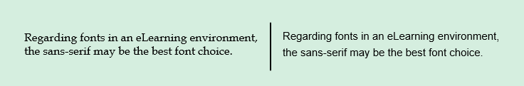
Looking at the font types example above, the sans-serif font (on the right) gives the text a more polished and clear look.
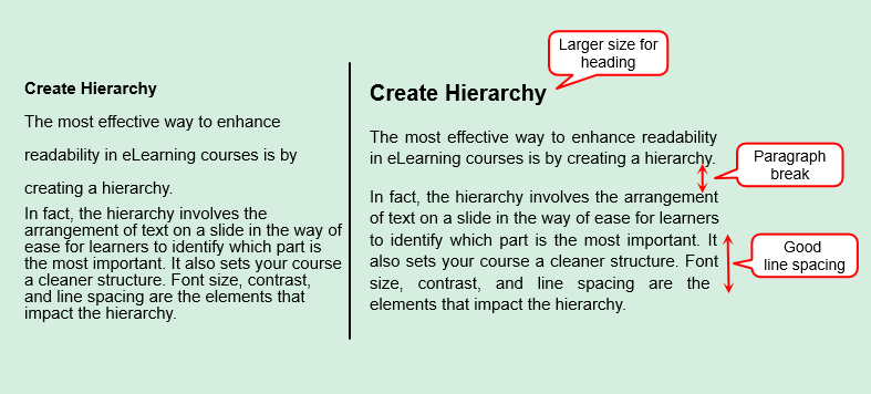
Create Hierarchy with Font Size, Contrast & Line Spacing
The most effective way to enhance readability in eLearning courses is by creating a typographic hierarchy. It involves the arrangement of text on a slide in the way of ease for learners to identify which part is the most important. It also sets your course a cleaner structure. Font size, contrast, and line spacing are the elements that impact the hierarchy.
Font Size
The same font size may vary from font to font. So it’s quite hard to specify the exact number for the best font size for eLearning. However, the 12px font size for body text is recommended as a standard size for easy reading. On tablets or phones, fonts with sizes between 14px to 16px are good to go. Also, try to avoid using a font less than 10px as it’s too tiny to read online.
Whatever the font size you choose, bear in mind that always use the larger sizes for titles, headings, or even significant pieces of content.
Contrast
The proper use of font contrast can bring out a good reading experience for learners in eLearning. Let’s say, don’t treat all body text equally as a dense block of text. In that way, it’s hard to read and uncomfortable to the eyes. Adding appropriate rooms between paragraphs can help organize your slide and maintain the flow of reading. In addition, to utilize the white space, make sure to put the body text occupying 20-40% of the screen.
Another thing about contrast property you should consider is setting the text color. Remember to make your text color stand out enough from the background. For instance, black and white are good for the body text. Meanwhile, you can use other colors such as green, red, blue for headings or subheadings. That helps more in attracting learners’ interests.
Line Spacing
In addition to paragraph breaks, good line spacing also helps enhance the hierarchy. If the spacing is too tight, learners’ eyes can be busy with crowded content. Otherwise, if you add too much space between lines, it’s pretty hard to cover all the content from line to line. On account of that, the recommended spacing between lines is 1.15 to 1.5px.
This eLearning typography example will give you a better understanding of the points:
Avoid Unnecessary Font Emphasis
In eLearning typography, using font emphasis is helpful when you want to highlight an important point, thus drawing learners’ attention to it. Ways to emphasize text may include underlining, bolding, italicizing, or capitalizing. But be careful because any excessive use might make learners confused, even ending up your slide with a mess.
Below are some tips to make your emphasis effective as desired:
- Keep the bold text for titles, headings, or significant words. Don’t overuse bolding in the body text.
- Use underlining to represent the hyperlinks.
- Apply italicization for indicating specific terms, quotes, or foreign words.
- Avoid ALL CAPS as these give a feeling of shouting.
- Consider using left-aligned text and avoiding centered text in the body text.
- Don’t overuse colored text since it may make learners distracted.
Minimize the Number of eLearning Fonts Used
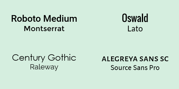
When using fonts in eLearning, keeping the number of fonts used at a minimum is essential. In general, you should not use more than 3 fonts in your course. Indeed, one font used is often sufficient. Using two fonts, one for heading and the other for the body text, is ideal. And three fonts are acceptable. Don’t use more! Otherwise, your course will look messy and unstructured. Also, take notice of the font weights if you combine different fonts to create a harmonious pairing.
Some suggested font pairings may be worth your consideration:
Notice New Fonts Embedding in eLearning Courses
How can I use a newly downloaded Google font for my eLearning courses? Or how can that font be readable on learners’ computers which don’t install it? These are the two most asked questions when it comes to new fonts. To address these concerns, you need the help of an eLearning authoring tool. Let’s take ActivePresenter as an example. Here we go:
- Download a new font on the Internet and install the font on your computer.
- ActivePresenter will automatically detect that new font. Then it’s ready to be used in your courses.
- Check the Embed Fonts option when exporting to HTML5 output. In that way, this font will display consistently on learners’ computers even when they don’t install that font.
Last Points
Fonts play an important role in displaying the content, especially in eLearning. An appropriate philosophy about fonts and typography can make a significant difference in the look and feel of the eLearning output. Taking these 6 tips into consideration, your next eLearning courses will never be boring or illegible for sure.
See also: