
Creating eLearning content is no longer just about designing for desktop computers. Today, learners access training materials on laptops, tablets, smartphones, and everything in between. If your course isn’t optimized for different screen sizes, learners may struggle with tiny text, overlapping objects, or broken layouts, all of which negatively impact the learning experience. That’s why a responsive eLearning project has become the new standard in online learning.
In this guide, you’ll learn what a responsive eLearning project is, why they matter, and how to create them in ActivePresenter. We’ll also cover how to convert existing courses into responsive ones and share several practical design tips to help your courses look professional on every device.
What is a Responsive eLearning Project?
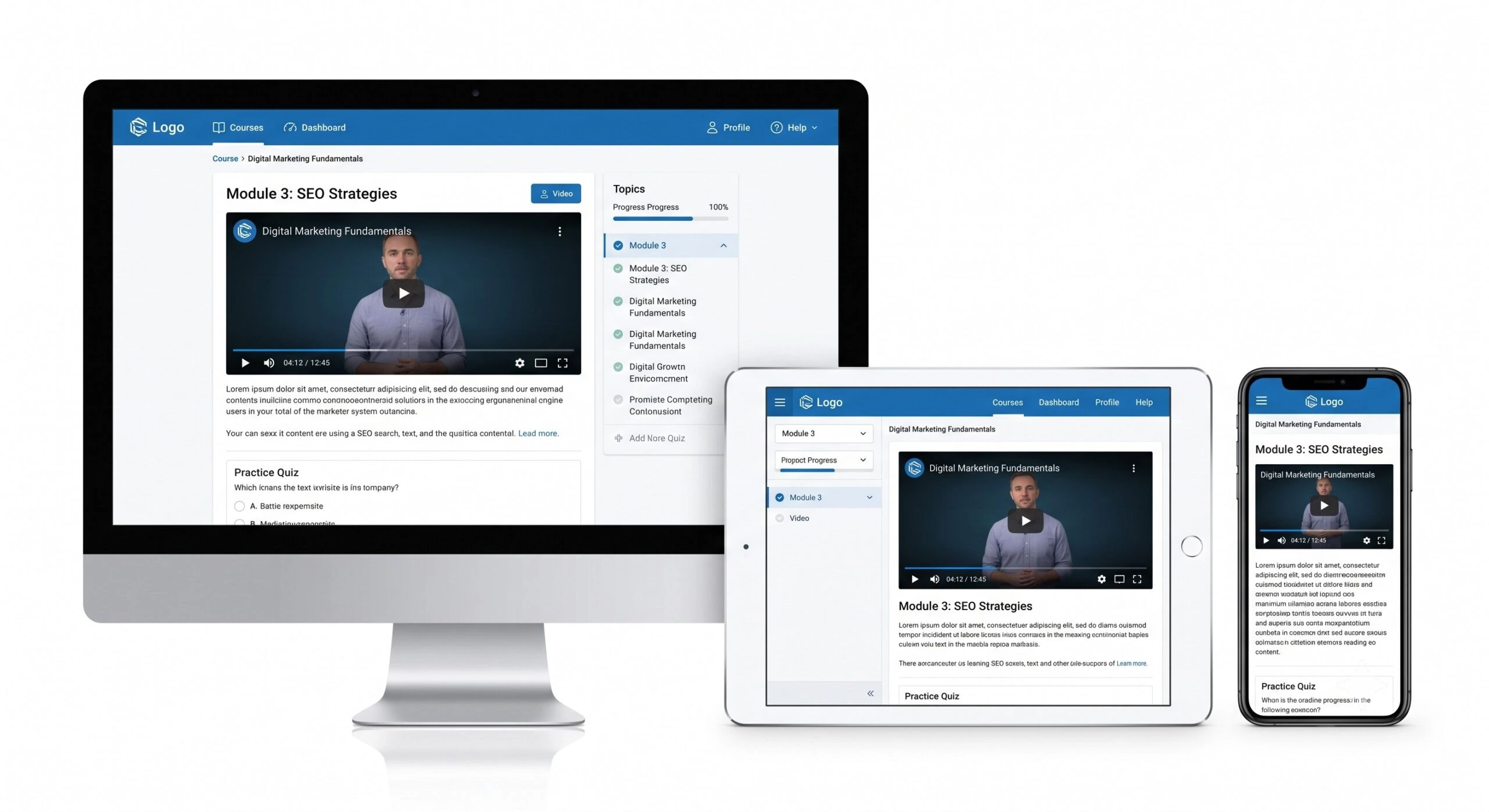
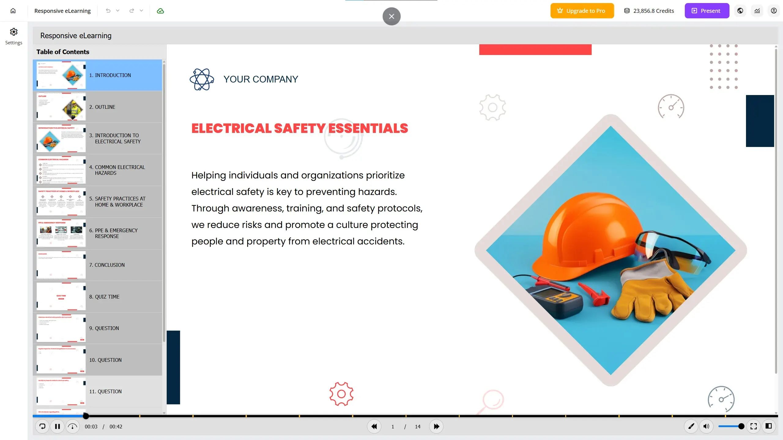
A responsive eLearning project automatically adapts its layout to fit different screen sizes. Instead of displaying the exact same arrangement on every device, responsive content intelligently resizes and rearranges objects so learners always enjoy an optimal viewing experience.
Imagine a course viewed on three different devices:
- A desktop monitor
- A tablet
- A smartphone
Rather than shrinking the entire slide until everything becomes unreadable, a responsive project reorganizes its content for each screen size.
This creates a smoother learning experience regardless of how learners access the course.
By contrast, traditional (non-responsive) courses use a fixed layout. While they may look perfect on large screens, they often require users to zoom, scroll, or struggle with overlapping content on smaller devices.
Best Tool to Create a Responsive eLearning Project: ActivePresenter
Choosing the right authoring tool is just as important as understanding responsive design. While some eLearning tools require separate layouts for desktop and mobile devices, others make responsive development much more efficient by automatically adapting content to different screen sizes.
ActivePresenter is one of the few eLearning authoring tools that includes built-in support for creating a responsive eLearning project. Whether you’re building software simulations, interactive lessons, compliance training, or online courses, it enables you to design once and deliver a consistent learning experience across desktops, tablets, and smartphones.
Instead of maintaining multiple versions of the same course, ActivePresenter uses responsive layouts that intelligently rearrange and resize content based on the learner’s viewport. This significantly reduces development time while ensuring your courses remain readable and easy to navigate on any device.
Some of the key responsive features in ActivePresenter include:
- Responsive Project: Start a new course with responsive layouts or convert an existing project into a responsive one.
- Layout Inheritance: Changes made to larger layouts automatically cascade to smaller layouts, minimizing repetitive editing.
- Customizable Viewports: Add, remove, or modify breakpoints to match your design requirements.
- Responsive Object Properties: Fine-tune object size, position, visibility, and scaling for each layout.
- Multiple Publishing Options: Export responsive courses to HTML5, SCORM 1.2, SCORM 2004, xAPI (Tin Can API), or upload them directly to an LMS such as uPresenter.
These features allow instructional designers and course creators to focus more on creating engaging learning experiences and less on manually adjusting layouts for every screen size. Whether your learners access content on a desktop computer during work or on a smartphone while traveling, ActivePresenter ensures your responsive eLearning project delivers a smooth and consistent experience.
Creating a Responsive eLearning Project from Scratch
The easiest way to build a responsive course is to start with a responsive project.
In ActivePresenter, there are two ways to do this.
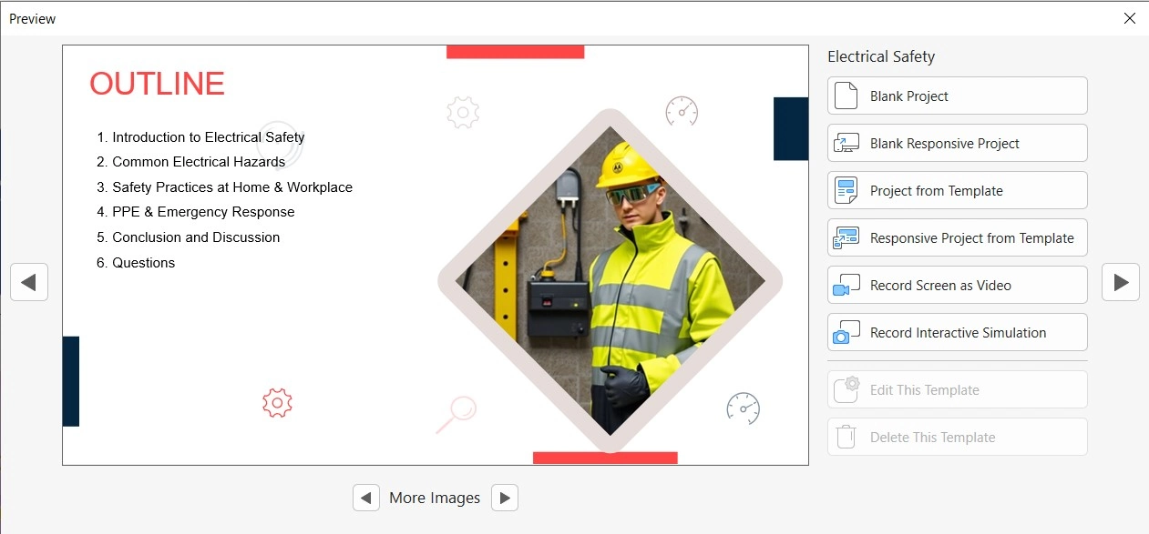
Option 1: Start with a Responsive Template
When launching ActivePresenter, open the Start Page.
Choose one of the available templates that supports responsive design. You can either:
- Create a Blank Responsive Project
- Create a Responsive Project from a Template
Templates provide a useful starting point if you already have a preferred course layout or visual style.
Option 2: Create a Blank eLearning Responsive Project
If you’d rather build everything yourself, simply choose Responsive Project from the Start Page.
This creates an empty responsive project where you can freely design every slide from scratch.
Once the project opens, you’ll immediately notice one of the most important tools in responsive authoring, the Responsive Bar.
Understanding the Responsive Bar
The Responsive Bar is the control center for designing responsive eLearning projects.
Instead of representing specific devices like an iPhone or iPad, it represents different viewport sizes. A viewport is simply the visible area where your course is displayed. Using the Responsive Bar, you can drag the slider to preview how your course adapts across various screen widths.
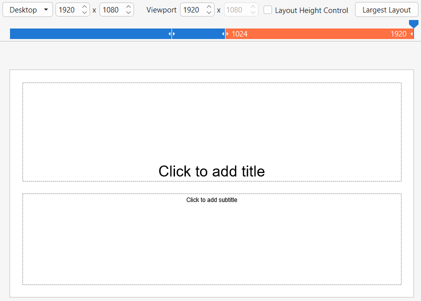
This allows you to instantly see whether:
- Text wraps correctly
- Images remain visible
- Buttons stay accessible
- Navigation still feels intuitive
Rather than repeatedly exporting and testing on multiple devices, you can review everything directly inside the editor. Even better, ActivePresenter allows you to customize the available viewports.
Depending on your audience, you can:
- Add new viewport breakpoints
- Remove unnecessary ones
- Adjust layouts to match your project requirements
This flexibility gives you precise control over how your course behaves on different screen sizes.
Add Content Just Like a Normal Project
One of the best things about responsive projects is that the editing workflow remains familiar. You can insert: Text boxes, images, shapes, buttons, videos, audio, interactive objects & quizzes. The same tools used in standard projects are available in responsive projects.
You don’t need to learn a completely new editing process. Instead, ActivePresenter handles the responsive behavior behind the scenes.
How Inheritance Saves Hours of Work
One feature that dramatically speeds up responsive course development is inheritance.
Here’s how it works.
Suppose you design your desktop layout first.
You adjust:
- Object positions
- Font sizes
- Image dimensions
- Alignment
- Spacing
By default, these changes automatically flow down to smaller layouts such as tablets and smartphones. This means you don’t have to recreate every slide multiple times. Only when a particular layout needs its own adjustment do you make changes specifically for that viewport.
For most projects, inheritance eliminates a tremendous amount of repetitive editing while keeping layouts consistent across devices.
Convert Existing Projects into Responsive eLearning Projects
Already have a completed course? You don’t have to rebuild it from scratch.
ActivePresenter allows you to convert existing non-responsive projects into responsive eLearning projects.
To do this:
- Open your project.
- Go to File.
- Select Project.
- Choose Convert to Responsive.
A conversion dialog appears with scaling options.
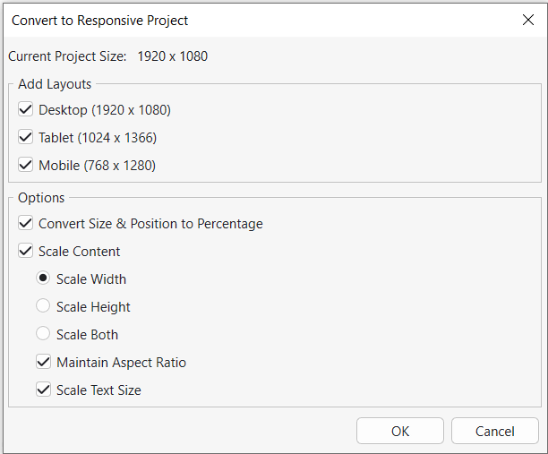
For most courses, selecting options that scale both text and images provides the best results.
After the conversion finishes, review every responsive layout carefully.
Although ActivePresenter performs most of the work automatically, some slides may benefit from small adjustments, such as:
- Repositioning images
- Breaking long text into shorter paragraphs
- Enlarging buttons for touch devices
- Adjusting spacing
Fortunately, these refinements usually take far less time than rebuilding an entire course.
If needed, you can also convert the project back to a standard non-responsive format later.
Preview Your Responsive Course Before Publishing
Testing is one of the most important steps when creating responsive eLearning projects.
Before publishing, preview your project by pressing F5.
This opens the course in your web browser.
To simulate different devices without leaving your computer:
- Press F12 to open Developer Tools.
- Enable Device Mode (or Toggle Device Toolbar).
- Choose different devices such as smartphones or tablets.
Now you can instantly see how your responsive layouts behave across multiple screen sizes.
Publish Your Responsive eLearning Projects
Once you’re satisfied with your course, ActivePresenter supports publishing to several popular formats.
You can export your project as:
- HTML5
- SCORM 1.2
- SCORM 2004
- xAPI (Tin Can API)
You can also upload your course to an LMS, including uPresenter, where learners automatically receive the appropriate responsive layout based on their device.
Whether learners access the course from desktops, tablets, or smartphones, the published project adjusts automatically without requiring separate versions.
Smart Tips for Better Responsive eLearning Projects
Responsive design becomes much easier once you understand a few advanced techniques.
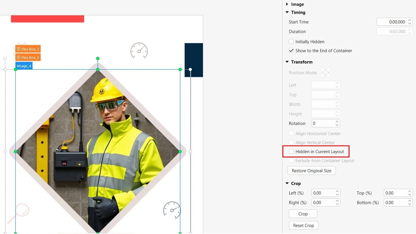
1. Hide Objects on Specific Layouts
Not every object belongs on every screen.
For example:
- Decorative illustrations
- Large background graphics
- Wide comparison tables
These elements may look attractive on desktops but occupy too much space on smartphones.
Instead of deleting them, use Hidden in Current Layout.
This hides an object only on selected layouts while keeping it visible elsewhere.
It’s an excellent way to simplify smaller screens without maintaining multiple versions of your course.
2. Enable Scale Height to Auto
Responsive layouts should maintain natural proportions as screen sizes change.
Whenever appropriate, enable Scale Height to Auto.
This helps objects resize smoothly without becoming stretched or compressed.
The result is a cleaner, more professional appearance across different devices.
3. Use Relative and Absolute Positioning Wisely
Positioning plays a major role in responsive design.
For most objects, relative positioning (using percentages) is the best choice.
Relative values allow content to move naturally as the viewport changes size.
However, some objects should always remain in a fixed location.
Examples include:
- Company logos
- Branding elements
- Persistent navigation buttons
For these items, pixel-based positioning often provides more predictable results.
Knowing when to use percentages versus pixels helps create layouts that feel polished on every screen.
Final Thoughts
As more learners complete training on smartphones and tablets, building responsive eLearning projects is no longer optional, it’s essential.
By following the workflow outlined in this guide, creating responsive projects, understanding viewport behavior, converting legacy courses, previewing across devices, and applying smart responsive design techniques, you can deliver engaging learning experiences that look great everywhere.
Ready to build eLearning courses that look great on every device?
Download ActivePresenter for free and start creating responsive eLearning projects that automatically adapt to desktops, tablets, and smartphones.
