5 Common Visual Design Mistakes in an E-course
Great content is at the center of every successful eLearning course but the first thing learners will see is always the course’s visual design. Packaging is just as important as the product itself. For eLearning designers looking to create visually stunning and engaging courses, ActivePresenter offers a comprehensive suite of tools to streamline the design process. From ensuring consistent branding through customizable themes and slide masters to providing precise object alignment and a wide array of annotation and interactive elements, ActivePresenter empowers you to craft a polished and professional learning experience from the very first screen.

Thanks to a multimedia tool like ActivePresenter to create a striking visual design, you can not only make a good first impression of the course but also arouse learners’ interest. So, this is not just a less-important factor that many eLearning designers might think, on the other hand, it does really matter. If you now start thinking about how to make your course look better, at the initial step, try to avoid the most common visual design mistakes as mentioned below:
Visual Design Mistake #1: Breaking Image Aspect Ratio
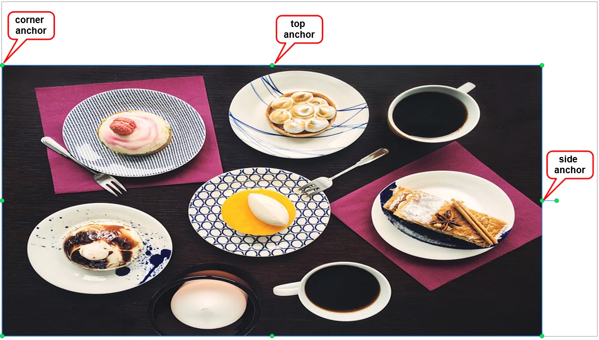
This is the most popular mistake happening when eLearning designers just focus on the course content rather than its appearance. When an image is inserted, its original aspect ratio may not be kept during the resizing process. It may look broken and unclear because of a common habit: scaling an image from a top and/or side anchor. As in the below image, it is stretched because of being resized from a side anchor:
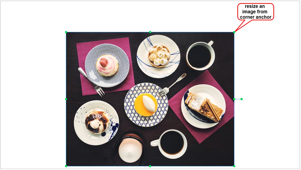
From now on, instead of scaling an image from a top or side anchor, you should adjust its size from a corner anchor to maintain the original aspect ratio:
Visual Design Mistake #2: Aligning Objects Sloppily
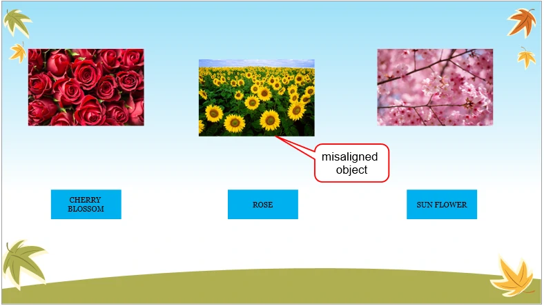
Aligning objects sloppily is another issue that can be easily recognized and fixed. This mistake happens when objects, texts, or images are misaligned on the screen:
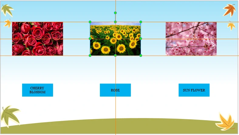
To fix this issue, you just need to pay more attention to align object properly. Some eLearning authoring tools like ActivePresenter can support users to place objects beautifully on the screen by simple clicks. For example, as in the below image, users just need to look at the orange lines (Canvas Snapping in ActivePresenter). These orange lines appear through the edge and the center of objects to help users align them perfectly. This app also helps to make many objects to be the same width, the same height, and the same size. In addition, it supports to align objects horizontally, vertically, center horizontally, or center vertically. Thereby, users can easily avoid this visual design mistake with very little effort:
Visual Design Mistake #3: Overusing Text and Objects
Many non-experienced designers are not sure which part they want to focus on. As a result, they tend to add all interesting information (texts, images, video, icons, and other objects) and pack it in their eLearning course. This leads to a fairly common issue: there are too many texts and/or illustrating objects on the screen. Consequently, learners cannot get the main idea. Bear in mind that humans prefer visual things because they help us to remember quickly and easily. Overusing texts and objects can be counterproductive because the more information and objects illustrated on the screen, the more time our brain needs to handle that information.

To avoid this issue, it is essential for eLearning designers to determine keywords that they want their learners to acquire. Then, try to use some short texts and just a few impressive objects to highlight that keywords. Using too many texts and objects does not impress learners as you might think, otherwise, it creates a chaotic look.
Visual Design Mistake #4: Bad Color Choices
Many scientific researches prove that colors have a great impact on not only our brains but also our moods, feelings, and emotions. Color can dramatically affect how your course is perceived by your learners. Therefore, be careful when selecting color scheme. Using too many colors or making a bad choice for color combination makes it hard to read the content on the screen and distracts learner’s attention.
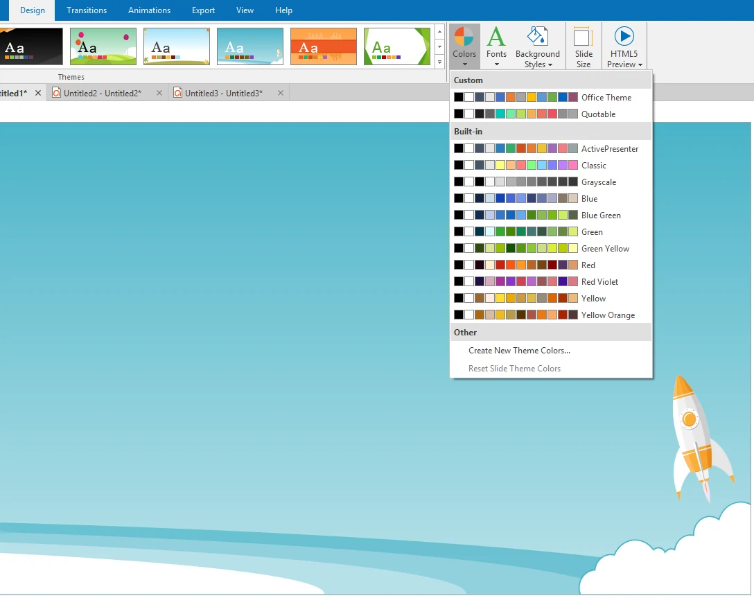
Learning and following rules for using colors are necessary if you want to make your course look more professional and interesting. In case you want to use built-in color schemes to save time and efforts, ActivePresenter can support 11 types of default color schemes. Besides, you can create new theme colors quickly in just few steps.
Visual Design Mistake #5: Inconsistent Visual Style
Inconsistent visual style is a common mistake for new eLearning designers. This visual design mistake is made when a designer tries to develop each slide separately. For example, each slide is developed with different color schemes, fonts, and formats.
Using slide masters in ActivePresenter can help to avoid this issue. Slide masters allow you to easily design the default themes, colors, fonts, background styles, texts, and objects for all slides in your course. Besides formatting, slide masters let you determine the placement of objects in slides. Thus, you can use slide masters to apply the same look and feel to multiple slides in your project.
The above are the five most common mistakes when it comes to eLearning course’s visual design. Bear in mind those mistakes to avoid them and see if you can challenge yourself to enhance your visual design. If you have something in common to share or if you have any questions, feel free to contact us. We can help to make your eLearning course much more beautiful and valuable with our tool. Let’s try ActivePresenter – the most powerful elearning authoring tool. Good luck!