Last Updated On: September 23, 2021
Responsive layout lets animations restyle to fit the device orientation and size changes. In this tutorial, you’ll learn the basics of responsive layout in Saola Animate.
This tutorial covers:
Breakpoints and Layouts
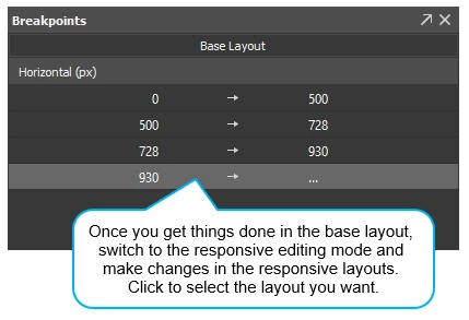
Responsive layout allows creating different layouts for a single document. Breakpoints mark the transition to a new layout with a different set of element properties and animations. You can create breakpoints for both horizontal and vertical viewport size changes. When viewing in a browser, the HTML5 player will load the suitable layout based on the current device’s viewport size. As the viewport size changes, the player will alter the layout, thus calling the new element properties and animations.Base Layout
Working on a responsive document, you’ll switch between two modes, base layout and responsive editing mode. The base layout is active by default so that you can work on it first. Element properties and animations in the base layout will be applied to all responsive layouts. Meanwhile, when you enter the responsive editing mode, you can override element properties and animations, thus creating different sets of styles which fit different layouts.