How to create an effective eLearning course design? What elements can drive your learners’ attention? You can find the answers in today’s blog.
Learning doesn’t have to be solitary anymore, and neither does your eLearning course design journey. Your design will, to some extent, place an impact on how well your learners perceive the sessions. With these practical and ready-to-use guidelines, you are set on the road to producing beautiful eLearning projects with minimal effort, while putting your project at the forefront of the audience’s mind.
We will go through this flow:
- Apply Basic Design Principles
- Utilize Color Palettes for eLearning Course Design
- Make eLearning Course Design Lively
- Personalize eLearning Courses
1. Apply Basic Design Principles
#1. Proximity
If the elements are next to each other, the brain will tend to collect them into a separate group. This applies to the proximity principle. The proximity design principle is the arrangement of objects in common in a group. Similarly, distinct objects will be split into separate groups. This means you must know how to arrange objects or elements of the work into related groups.
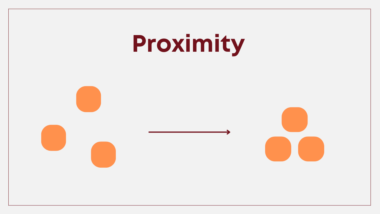
Design elements that are arranged in relation to each other will create an organization, making an important contribution to effectively and clearly conveying the message to the audience. Applying this principle helps keep your design structure stable, and information flow control in the right direction.
This principle of closeness is helpful when you teach and have many layers of information. In doing so, it will increase the memory ability of students. Since information is combined into separated groups, it will support students in absorbing a great amount of knowledge at once.
#2. Negative Space
If you look at graphic design as a process of arranging images and text, that’s half of the story. Space is also part of the design. To work more effectively with space, it is necessary to be aware of it and learn to see the shapes space forms and how space represents itself.
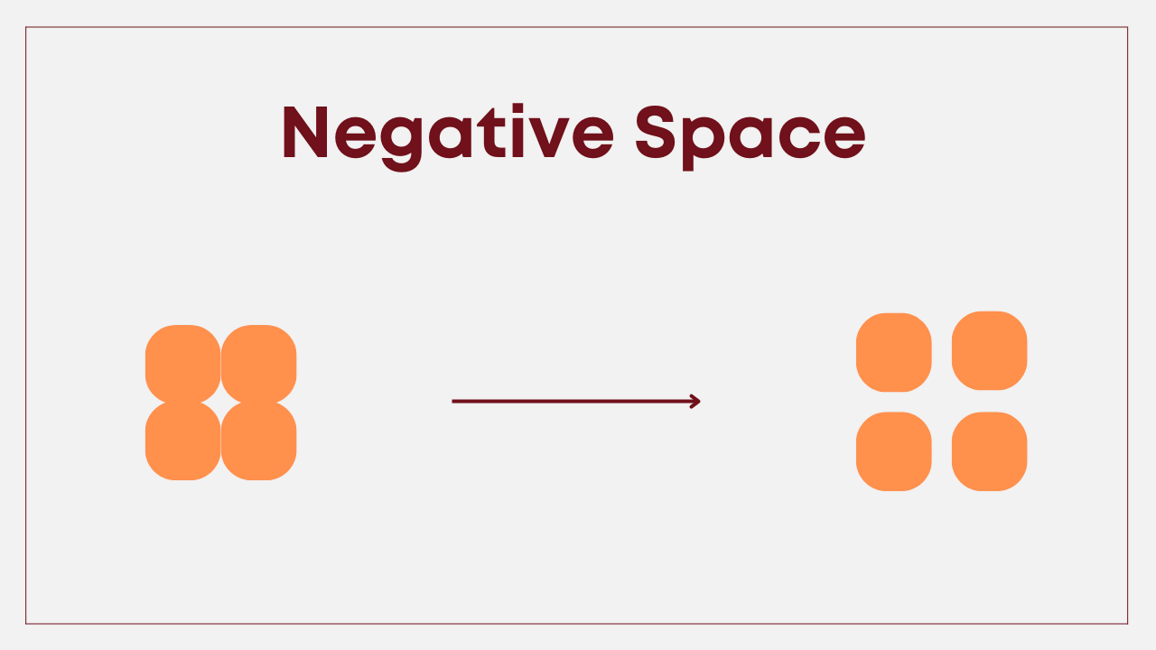
Negative space is the empty space around the main object of a design or of an image. Blank space can be colored or colorless and does not contain any content, including text, images, or other design elements. The more negative space around the subject, the more visual focus is on the main goal of the design. Any design needs a negative space. Your eLearning course design without negative space will make the design too cramped since the viewer’s eyes will be scattered everywhere and can’t focus on the message the designer wants to convey.
Using negative space will let the objects space for breathing, and so for your students. If you cram your students with a wall of texts and very little white space, it causes eye irritation and by nature, it lessens your student’s enthusiasm for study.
#3. Alignment
Obeying alignment in designing is not a brand-new principle, you may encounter it elsewhere. You have come across alignment when designing PowerPoint arranging objects in a certain order: left, right, bottom, top, middle, and center. Not only align for the object but the text can also be aligned. In a simple definition, alignment refers to the arrangement of different design elements in different positions. Aligning objects helps to tighten the design and create a visual connection among them.
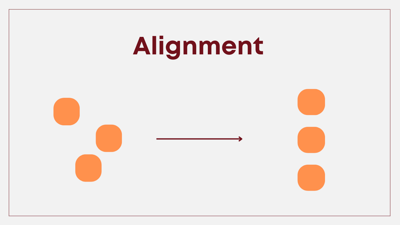
Without alignment, the elements appear to be directionless, chaotic, and disjointed. Using alignment avoids distracting the viewer’s visual navigation and creates a professional layout. Alignment makes the design look neat and easy to understand. No one likes to look at a design with text and graphic elements distributed unpurposely. You can read mistakes to avoid when design eLearning courses for reference.
#4. Repetition
Repetition in design is simply reusing the same or similar elements throughout the design work. The repetition of certain design elements gives a clear sense of uniformity, continuity, and consistency to your projects. The ultimate goal of repetition is to make a lasting impression on your target audience.
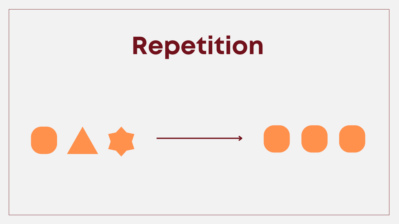
Repetitive design using a consistent element: Repeating colors, fonts, words, or shapes can help tie your entire course content together. When it comes to creating an eLearning course design, using repetition can make a big impact when applied correctly. These elements can function as the anchor for keynotes, so your audience can retain the memory better after each part. Moreover, repetition does not mean disorder. In fact, repeating an element gives depth and dimension to your design, and directs eye flow.
#5. Contrast
The human brain processes visual data very differently than text. For text, the human eye moves along every single line. But when people look at images, their brain immediately collects and processes a huge amount of information in the blink of an eye.
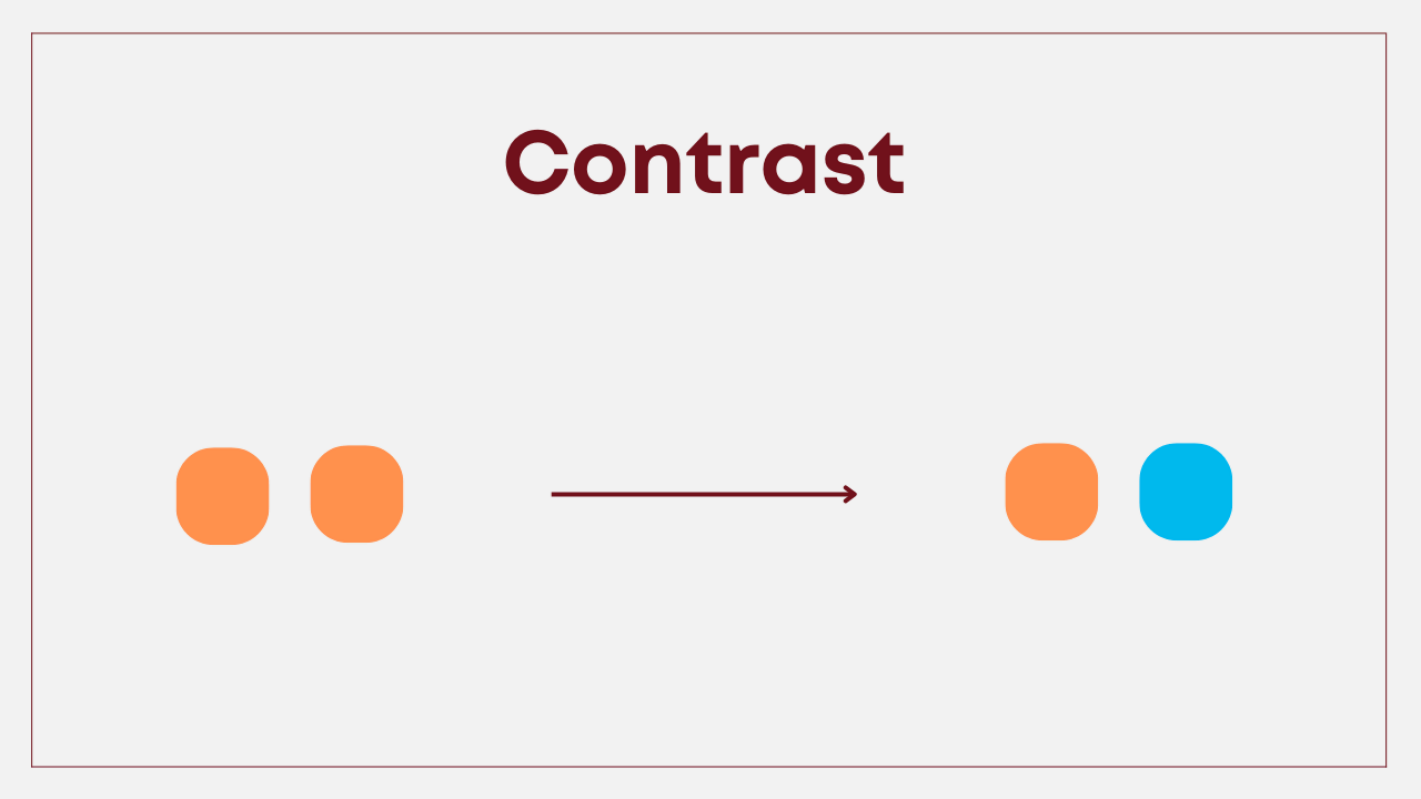
Contrast is an old-but-gold tool to compare and highlight the element you want when designing eLearning courses. People often use contrast techniques in their daily talk, in films and movies. Contrast, by then, is frequently used as a sharp tool in designing to reveal differences between two elements in the design. Some common forms of contrast are light/dark, thick/thin, big/small, etc. This is how you make an element stand out from the rest of your design to the point of drawing people’s attention to that element. For example, educators can use contrast with text, color, and image to emphasize and highlight parts of the content they prefer.
#6. Focal Point
The students’ focus on the lesson lasts for a very short time. If not impressive enough at first, the lesson will gradually go out of the head. Therefore, the focal point was born for the purpose of emphasis. We couldn’t highlight everything. For one thing to stand out, the other must be sacrificed in the background.
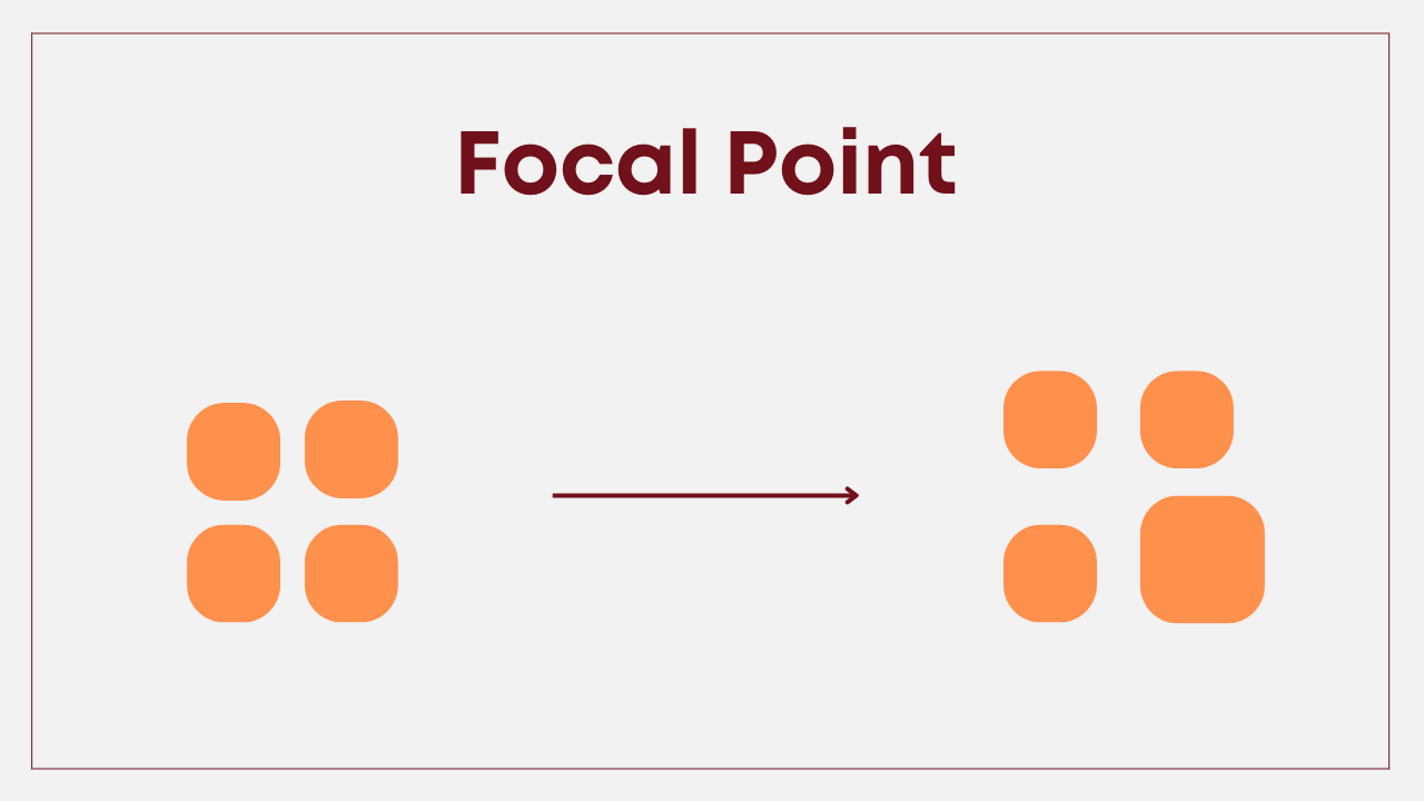
A focal point is the area of interest, emphasis, or differentiation capturing the viewer’s attention. The focal point is the user’s visual entrance in their journey to view the project. They are first attracted to the focal point, then gradually spread their attention to the information routes later. Focal points can be in the form of images, images, or even text and are key elements for eLearning course design.
2. Utilize Color Palettes for eLearning Course Design
Speaking of education in general, and eLearning in particular, there are certain colors that fit well in this industry. Below are 5 suggested colors to apply for designing an eLearning course.
Blue in eLearning Course Design – For Trust
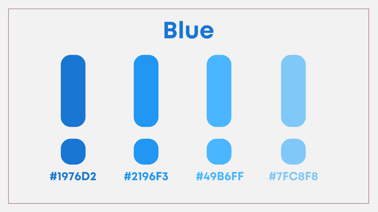
As one of the most frequently used colors in the eLearning course design, blue symbolizes trust, freedom, and relaxation. Moreover, it can easily stabilize the emotions of the visitors and helps them to be rational and more alert. Using the right combination of blue with emotionally stimulating colors will bring impressive effects. Such light blue will bring a sense of calmness, lightness, and fragility, while dark blue will express strength, stability, and professionalism.
Red in eLearning Course Design – For Energy and Optimism
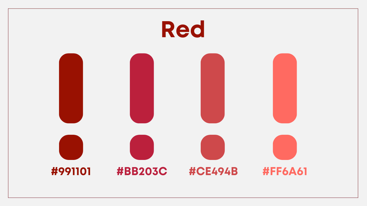
Red reminds us of strength and power. It is also the color of emotions, enthusiasm, and love. Light red will bring a sense of enjoyment, passion, and sensitivity while dark red will bring the feeling of courage, leadership, and determination. However, as a very hot color, you need to pay attention to the appropriate ratio and avoid using too much hot red which will make the viewer feel frustrated.
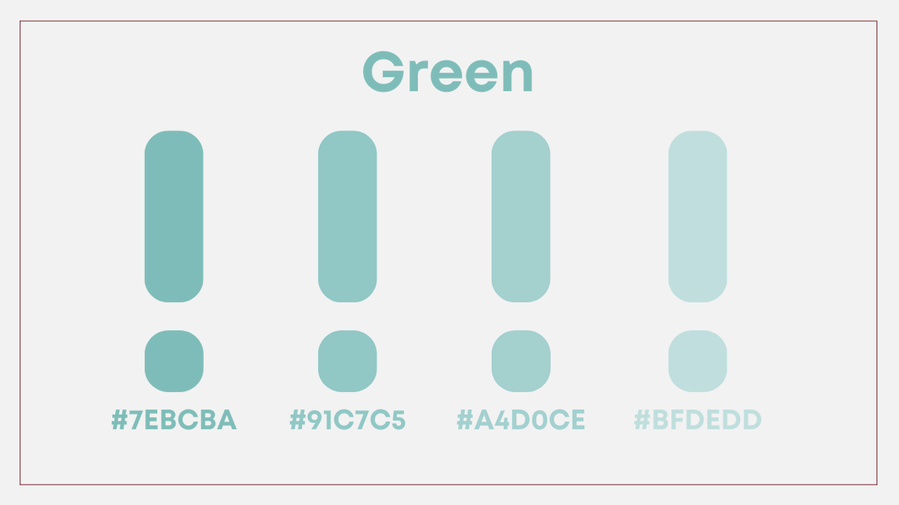
Green in eLearning Course Design – For Fresh and Youth
Green is the color symbolizing nature, freshness, development, and safety, so it is very suitable to be used as the main color for an educational design. Light green will bring us a sense of freshness and cleanliness, while dark green brings about the feeling of youth and growth.
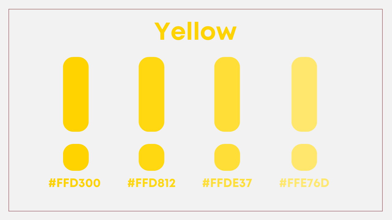
Yellow in eLearning Course Design – For Warm and Happiness
People often associate yellow with wisdom, strength, and happiness. This color gives viewers a feeling of warmth, and excitement, and stimulates the mind to work more intensely, light yellow is also one of the colors that easily attract people’s attention.
However, it is advisable to use yellow in creating an eLearning course design, which is the frequency of use. Due to its ability to stimulate human emotions, using yellow to a certain extent with light shades can bring good results, however, using too much yellow will cause unpleasant feelings in the audience.
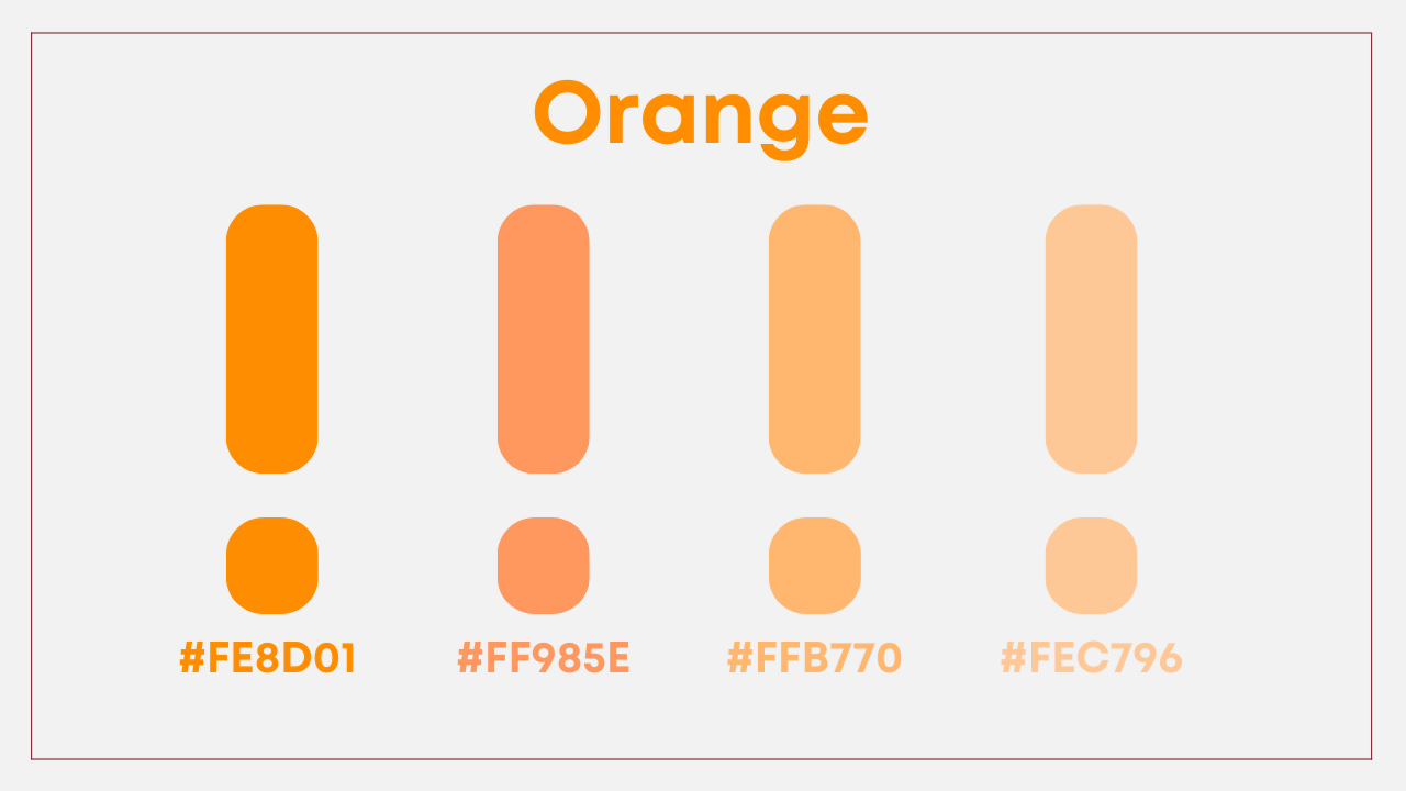
Orange in eLearning Course Design – For Enthusiasm and Cheerfulness
Orange, the color of enthusiasm and joy, is the color symbolizing attraction and creativity. Also a hot color, but thanks to the neutralization of yellow, it does not have a strong emotional impact like red.
Orange has the ability to increase oxygen to the brain, allowing the brain to work better, and more creatively. However, like the above two colors, orange should only be used in moderation in design to avoid causing bold, unwanted emotional effects.
Also, we strongly advise you to get certain visualizations on how to combine colors to beautify the design. After that, you can look up websites for color scheme generators to get fascinated with working with colors.
3. Make eLearning Course Design Lively
We may experience a situation at least one time, that is when the speaker starts their speech for a short period of time, at the beginning, we can focus and catch the ideas of the speaker well. Then as time passes by, we end up focusing on other things. It may be due to the nature of the speaker but also depends on how you design the course as well. One way is to pay attention to visual design elements. The other way is to change the way we create the content, such as converting from static to dynamic to call for students’ engagement like these 2 below suggestions:
#1. Interactive Video
The easiest way to test students’ memory and make sure they understand the video lesson, is to add quizzes when the video is playing. By doing so, the whole class can discuss together to complete the question. Otherwise, they cannot continue to watch the rest of the video. You are able to producr this interactive video at ease with an authoring tool, such asActivePresenter.
#2. Quizzes and Gamification
Interactive videos can do a great job of requiring students to focus on the video content, but we cannot overuse them to attract attention from students. Game-based lessons appear to be a great substitute in this case. It empowers the students to be active in the class, now the teacher will be the supporter and only interfere when in need. By then, it would reduce on-class workload for teachers while maintaining class quality. Let’s see this eLearning sample made by ActivePresenter for better understanding.
4. Personalize eLearning Courses
People will feel more excited when seeing something customized to make for them. The story stays true and can apply to the students. Personalized learning is, in a nutshell, learner-centered instruction. It places the learner at the center of the educational process. Everything else is then planned to complement their skills, requirements, and interests. In this manner, students are given “voice and choice” about what, how, when, and where they learn. That’s what “personalized” contains in its meaning.
What content can you personalize? You are able to
- Personalize learners: “Good morning, [Name], welcome to class.
- Personalize learning goals: Allow them to select topics they want to learn (History, Physics, Programming, etc.)
- Personalize Feedback: feedback pops up and scores (if any) with instruction in real-time for students
To do all of the above, eLearning course design from ActivePresenter enables you to produce fascinating content to bring your eLearning courses to the next level. Let’s see how ActivePresenter does the busy work for you in this example:

Wonder how to do that? You can find it by using text variables to create automatic repeat text
Activepresenter is absolutely your one-stop shop for interactive video support for eLearning course design. Download ActivePresenter for free today with no time restriction.
Download ActivePresenter Free Version with Unlimited Time Trial!

Ending Notes
Stated above are bite-sized and practical guidelines that you can feel free to inherit and “wow” your audience. It can even become your potential job in the future. Follow our Blog and YouTube channels to master your eLearning course design skills.
See also:
How to Create eLearning Courses with ActivePresenter