Already built delightful HTML5 animation but now getting concerned about your page load time? An elegant animated preloader (also a loading screen) is what you need to brighten up the seconds of waiting.
This tutorial covers:
What is a Preloader?
It’s essential for your page to preload contents so that they will be available once they are required later on. That’s what a preloader (also a loading screen) does. It helps you avoid bad experiences such as images slowly peeling down the screen. Thus, it prevents your page from appearing broken when it tries to load large files.
At the same time, loading screens provide feedback to users by telling them that the process is in action. Without them, users may feel uncertain about the site, get frustrated, and quickly move on.
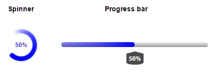
You’ve likely encountered thousands of loading screens while surfing the web. Typically, they show a numeric and/or visual indicator of the loading process. A spinner or a progress bar often appears when the loading begins and fades away when everything is ready.
Customizing the Loading Indicator
Saola Animate documents preload all image resources before showing a scene. By default, a loading indicator including a spinner and a percentage sign is displayed to show the loading progress. 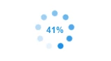
You can easily customize the look and feel of this loading indicator. Moreover, in case you don’t satisfy with it, thinking that it rather simple and boring, you can create your own loading screen.
To customize the loading indicator, do the following:
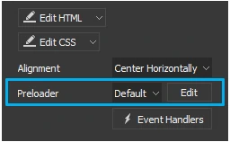
Step 1: Open the Document pane. If you don’t see this pane, on the main menu, click View > Document.
Step 2: Click Edit to customize the default preloader in the Preloader window.
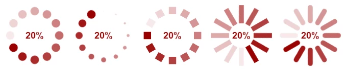
The loading indicator has six editable properties. To adjust their values, you can drag the handle on the slider, scroll the mouse wheel, or enter a new value.
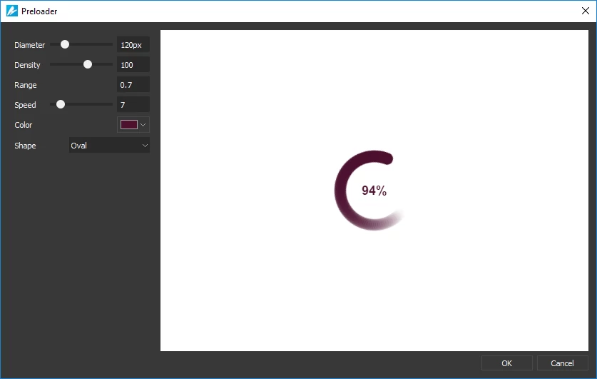
- Diameter: Set the diameter of the loading indicator.
- Density: Set the number of shapes drawn on the loading indicator.
- Range: Set the amount of the modified shapes in percentages. Specifically, it sets what range of the shapes should be scaled and/or faded. The shapes that are out of this range will be scaled and/or faded with a minimum amount only. If the range is 0.1, every shape out of the range will be scaled and/or faded to 10% of the original values. The visually acceptable range value should be between 0.4 and 1.5. The default value is 1.0.
- Speed: Set the speed of the loading indicator animation. This value tells the loading indicator how many shapes to skip by each tick.
- Color: Set the color of the loading indicator in RGB.
- Shape: Set the type of the loading indicator shapes, including oval, spiral, square, rectangle, and rounded rectangle.
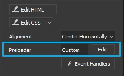
Creating a Custom Loading Screen
You can create a custom loading screen. In the Document pane, select Custom preloader and click Edit.
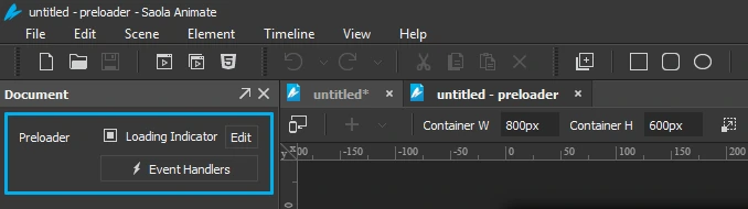
This opens a preloader document where you can create a loading screen of your own. You can insert elements and create animations as normal.
Take note of the following:
- The loading indicator appears by default, but you can clear the Loading Indicator check box to turn it off. Of course, you can click Edit to modify it as normal.
- A custom preloader document will close if you close the main document or if you switch from custom to default preloader.
For tech-savvy users, take advantage of the preloader events to add interactivity to your loading screen. Saola Animate offers five events as follows:
- Start: Occur when the preloader starts.
- Progress: Occur when the preloader is in progress, from start to end.
- Complete: Occur when the preloader loads all resources completely.
- Item Start: Occur when the preloader starts loading one resource.
- Item Complete: Occur when the preloader finishes loading one resource or a load error happens.
Note: Seeing clever but simple animation may distract you from waiting too long. So, it can be a nice choice to create a cool loading screen for delay. But remember not to over-animate your loading screen or you may overload your document with unnecessary graphics. At the end of the day, your loading screen must be lightweight, otherwise you may have to wait for it before waiting for the page. Definitely, it’s weird and ineffective.
So now don’t worry about your Saola Animate animation anymore as it always goes with a elegant spinning loading indicator. Of course, it’s all up to you to get creative and create your own preloading effect.