Flexible layout uses relative units and different types of positioning to adapt the document content to the browser window size. This tutorial shows you how to use flexible layout to relatively position and resize elements.
This tutorial covers:
Relative Positioning and Sizing
You can define the position and size of scenes and elements in pixels (px) or percentages (%). Pixels are fixed-sized unit that’s not scalable. When you define the position and size of an element in pixels, the element appears as exactly that position and size no matter the viewing device. Meanwhile, percentages are scalable unit. Using percentages keeps the position and size of an element relative to its parent.
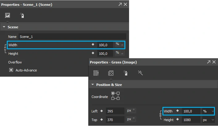
For example, by default, the scene width and height in a responsive document start at 100% of the container. This makes the document expand or contract to fill the width and height of its container. If you reduce the width value to 50%, the document will only expand to fill half of the width of its container. Regarding relative positioning, you can position an element 30% away from the left edge of the scene to keep its relative between to this edge regardless of the viewport sizes.
Let’s take another example. You want to a top level image to stretch the full width of the page while the page fills the width of the browser window. For that to happen, first you set the scene width to 100%, making the scene take up the entire viewport width. Then, you set the width of the image to 100% to make it stretch the full width of the scene.
Maintaining Aspect Ratio
Building responsive content, you want your content to nicely adapt to different screen sizes. While this is fairly easy with text, images are different. If you want your image to resize depending on the screen size, you have to preserve the aspect ratio of the image as it gets resized. This is essential to not only images but also other types of elements such as videos.
The solution is simple. To maintain the aspect ratio, set the width or height of an element to percentages and the other dimension to auto. For example, you set the size of a top level image as below:
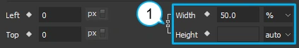
As you set the width to 50%, the image takes up a half of the horizontal space. With the height set to auto, the image’s height changes proportionally to the width, ensuring the aspect ratio remains the same.
Note: To preserve the aspect ratio while editing, select the Link width to height check box (1). The element will resize proportionally within Saola Animate.
Using Coordinates to Pin Elements
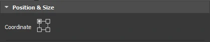
Another use of flexible layout is element pinning. Thanks to the coordinate modes, you can set an element to relative to the top left, top right, bottom left, or bottom right corner of its parent. This affects how the element adapt to the viewport size changes.
When you use percentages to position an element, the relative distance from that element to the pinned corner of its parent will remain unchanged. For example, you want to create a hamburger button in the top right corner of the page. The button must maintain its position to that corner regardless of the viewport sizes. So, you have to set the coordinate mode of the button to top right to pin it to that corner.
The coordinate modes also affect how elements are resized. When you adjust the width or height of an element, it will shrink or grow to the opposing corner but not the pinned corner. For example, you position an element relatively to the bottom right corner of the scene. When being reduced, its bottom right corner stays where it is while the rest of the element shrinks.
That’s how you can use flexible layout to create responsive content. Feel free to ask us if you need any help.