Let’s come to another chart type that ActivePresenter 9 brings out: the Bubble chart. This chart type is ideal if you want to compare numerical values in three dimensions simultaneously.
That is to say, a Bubble chart in ActivePresenter 9 presents data points in bubbles. The first two dimensions correspond to horizontal (X) and vertical (Y) axes that define the location of bubbles. Meanwhile, the third dimension is reflected in the bubbles’ sizes.
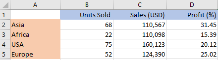
For example, you want to compare 4 sales territories through the number of units sold, sales, and profitability of each region. And you have the following sample data set:
For visualizing those 3 sets of values, using a Bubble chart is a proper choice.
Follow this procedure to create a Bubble chart in ActivePresenter 9:
- Insert Bubble Charts
- Edit Data for Bubble Charts
- Change Bubble Charts’ Styles
- Adjust Chart Layout
- Preview and Export the Charts
Insert Bubble Charts
To insert a Bubble chart, do the following:
- Click the Insert tab > Chart.
- Select the Bubble chart type on the left pane in the Insert Chart dialog.
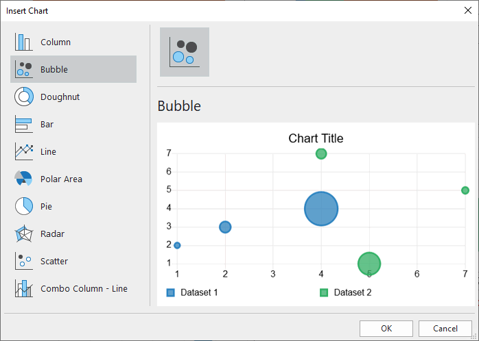
- Click OK to insert.
Edit Data for Bubble Charts
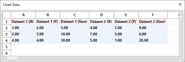
After inserting a chart, the Chart Data window appears with default values.
Note: When you select the chart, this window should be shown up. If not, you can right-click the chart > select Edit Chart Data.
Then, simply edit the defaults with your data:
- Select a Dataset cell (eg. Dataset 1 (X)) and change its text to Asia, Africa, USA, or Europe. When you’ve done, the (Y) and (Size) cells’ texts of that dataset will be updated accordingly.
- Add further datasets by selecting a blank cell in the first row, then type your Dataset name.
- Select the value cells and remove or enter your data values.
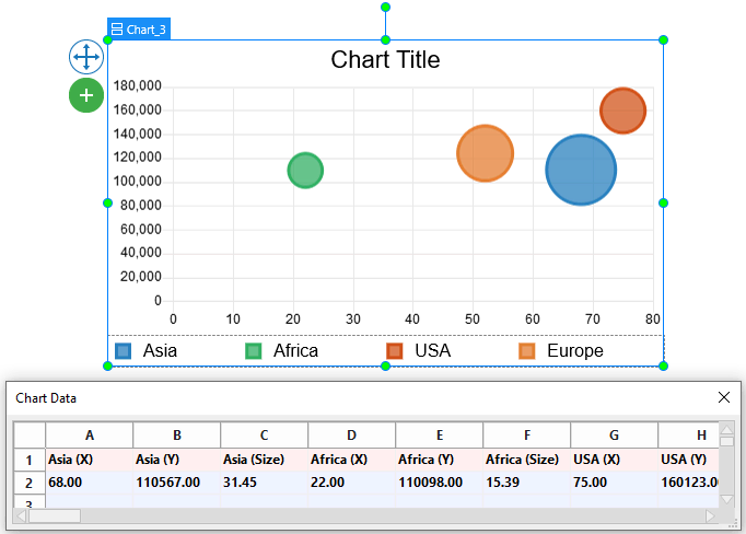
All the changes you made will be immediately shown in the chart like this:
Change Bubble Charts’ Styles
To begin with, let’s define some of the Bubble chart’s elements. By doing so, you can know more about elements to be customized.
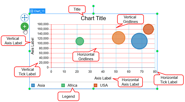
Note: Some elements are not shown by default. You can select the chart > click on the plus button ![]() > choose to show or hide any elements.
> choose to show or hide any elements.
After that, navigate to the chart Properties pane > Chart > Style. This section lets you customize the background fill and line of the datasets, as well as gridlines, tick labels, and axis labels.
Customize Datasets
The Dataset means data values presented in a colored bubble. You can choose to customize any dataset by clicking the drop-down Dataset list.
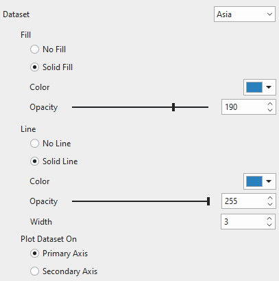
- Fill and Line: Fill the dataset and its line border with a single color, respectively.
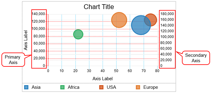
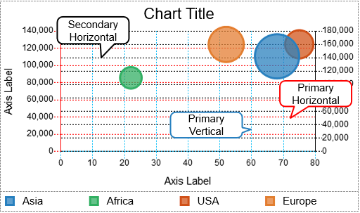
- Plot Dataset On: Choose between Primary Axis and Secondary Axis to plot a dataset on. In the Bubble chart, the primary axis runs along the left side of the chart and the secondary axis runs along the right side of the chart. You can use a secondary axis when data values vary greatly between one another without the need for additional charts. Note that you cannot plot all the datasets in the secondary axis.
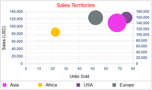
For example, the Africa (green-colored) and USA (brown-colored) datasets are plotted on the Secondary axis. Meanwhile, the Asia (blue-colored) and Europe (orange-colored) datasets are plotted on the Primary axis.
Customize Scale Options
In this section, you are free to adjust the gridlines, tick labels, and axis labels corresponding to the axis that the dataset is plotted on.
To begin with, you can click the drop-down list on the Axis option. Then, choose one of the chart axes. There are four types of axes: Primary Horizontal, Primary Vertical, Secondary Horizontal, and Secondary Vertical.
Note: The properties for the Secondary Horizontal and Secondary Vertical options are only available when there is at least one dataset plotted on the Secondary axis
Gridlines
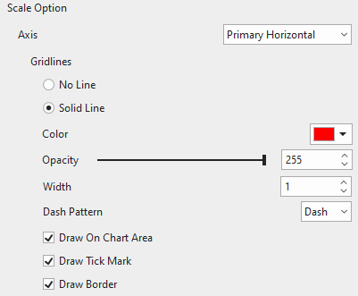
Gridlines are lines that cross the chart area to indicate the divisions on the axes. You can choose to draw gridlines of the currently selected axis with a single color or not. Adjust the transparency and the width of the gridlines the way you want.
- Dash Pattern: Change the pattern of gridlines.
- Draw On Chart Area: Tick the checkbox to draw horizontal/vertical gridlines on the chart area. Drawing gridlines helps viewers understand what values are represented by unlabeled data points.
Note: Since the Bubble chart is a vertically oriented chart, there are no Secondary Vertical gridlines.
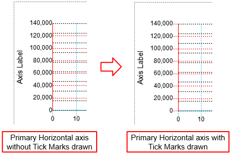
- Draw Tick Mark: Tick the checkbox to draw lines which are the extension of the gridlines from the axis border to the tick labels.
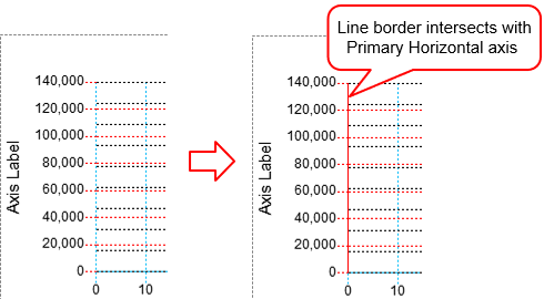
- Draw Border: Tick the checkbox to draw a line border at the edge intersecting with the corresponding axis.
Tick Labels
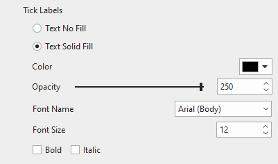
Fill the tick labels of the corresponding axis with a single color. You can also change the font name, font size, and make the tick labels bold and/or italic the way you want. Otherwise, if you want the axis to have no tick labels, just select Text No Fill.
Axis Label
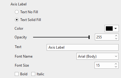
Fill the axis label of the corresponding axis with a single color. Enter a new name of the axis label in the Text field. Moreover, change the font name, font size, bold, and/or italicize the axis label as you like. If you don’t want to show the axis label, select Text No Fill.
Note: The Secondary Horizontal axis has no tick labels and axis label.
Adjust Chart Layout
It’s possible to adjust the chart layout if you want. Just select the whole chart. Then, access the chart Properties pane > Size & Properties > Container Layout.
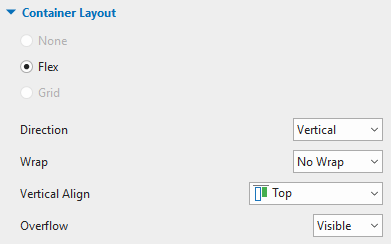
Note that a Bubble chart has 3 parts, namely chart title (at the top), chart area (in the middle), and chart legends (at the bottom). You cannot adjust them manually due to the nature of the Flex layout. Instead, just select each chart part then customize it in the Properties pane > Size & Properties > Flex Child.
So finally, your chart should look like the below chart.
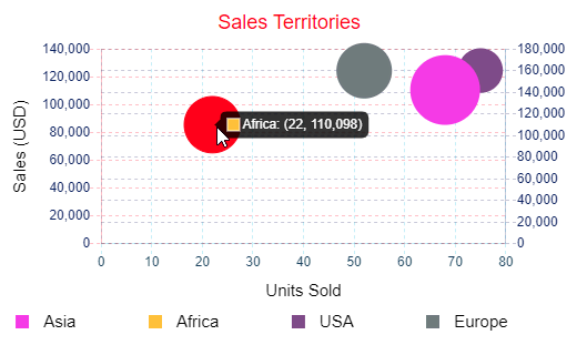
Preview and Export Bubble Charts
Actually, viewers can interact with the chart in the HTML5 output. That is to say, when viewers hover the mouse over the datasets, data values will be labeled and highlighted. That helps viewers interpret the data more easily.
All things considered. That’s how you work with the Bubble charts in ActivePresenter 9. Don’t hesitate to download the app and give it a try.

Related articles: