Flex box is a flex container that can hold objects. It is made for one-dimensional layouts, which means the child objects can be laid out either horizontally or vertically.
As you know, a grid box is two-dimensional that can distribute child objects both horizontally and vertically. Meanwhile, a flex box is the best for arranging items in either a single row or a single column.

In this tutorial, you will learn how to use flex box to create a simple example in ActivePresenter 9:
Insert Flex Box
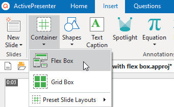
To insert a flex box, you click on the Home or Insert tab > Container > Flex Box.
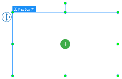
After that, a flex box will appear on the Canvas. You can click on the green plus button in the center to add any types of objects or questions you want.
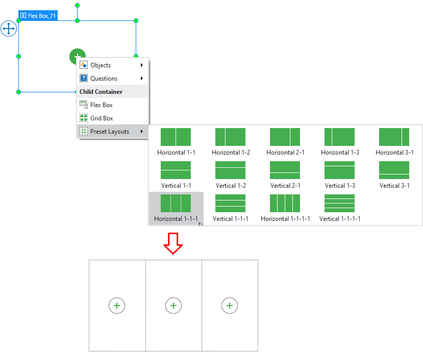
A flex box can contain one or more other flex boxes. Select Preset Layouts to insert one of the pre-made flex layouts.
Customize Flex Child in Flex Container
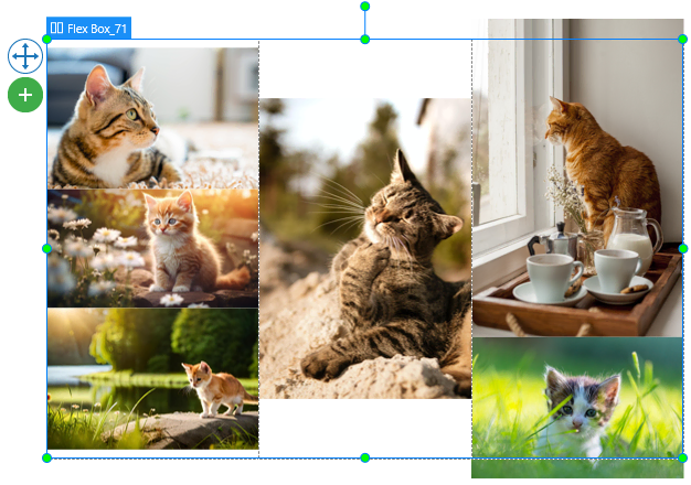
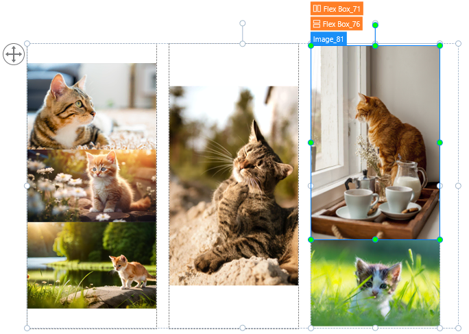
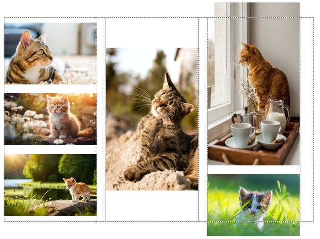
When you add an object to a flex box, the object is called a flex item or flex child. For example, the flex box above contains three small flex boxes. You can click on the plus icon in the center of each box to insert other items.
Tip: There may be several flex items overlapping others. Then you can click on the label at the top to make sure you select the right item.
As the flex box uses the flex layout, a flex item can adjust itself to fit the container. You cannot change size and position of a flex item manually on the Canvas. Instead, you can do that through the flex container layout and the flex child properties.
Adjust Flex Container Layout
The flex container layout contains the properties of the whole Flex Box (Flex Box_71). You access the Flex Box’s Properties pane > Size & Properties > Container Layout.
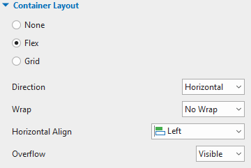
| Direction | Flex layout will keep objects displaying along a row (in the horizontal direction) or a column (in the vertical direction). Select the direction (either Horizontal or Vertical) that you want to align objects. |
| Wrap | Select No Wrap or Wrap to specify whether objects should be in one line or wrapped onto multiple lines. Note that the wrapping behavior only happens when items in a flex box are too large to display all in one line. In this case, when you select Wrap, they will be wrapped onto another line. |
| Vertical/ Horizontal Align | Align items vertically or horizontally. |
| Align Columns/ Align Rows | When the Wrap option is selected, flex box allows breaking objects into multiple lines. Use the commands to align those lines. |
| Overflow | Determine how the content in a flex container is displayed if it overflows the container and whether a scroll bar should appear or not. Visible: The overflow isn’t clipped and it renders outside the container. Hidden: The overflow is clipped; any content that extends beyond the container will be hidden. Auto: If the overflow is clipped, a scroll bar will appear and help you view the rest of the content. Note that you can only scroll the scroll bar from left to right and from top to bottom in the flex box. Therefore, all items that overflow the left and/or top position of the flex box couldn’t be shown. |
Apply to this sample:
- Keep all the properties for the Flex Box_71 (flex container) as the default.
- Select each small flex box, change the Vertical Align to Middle, and Overflow to Hidden if you don’t allow content to overflow in HTML5 output.
Change Flex Child Properties
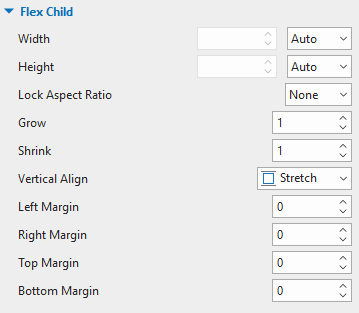
As the three small flex boxes are inside the flex container, they are also the flex children of the flex container. You can see their properties in the Properties pane > Size & Properties > Flex Child.
See the explanation below:
| Width/Height | Define the base width/height of a flex child by percentage, pixel or auto. Auto means the base width/height is based on the object content. The content can be either text if the object is a shape or the total base width/height of children if the object is a nested flex box. |
| Lock Aspect Ratio | Define the base width/height of a flex child by percentage, pixel, or auto. Auto means the base width/height is based on the object content. The content can be either text if the object is a shape or the total base width/height of children if the object is a nested flex box. |
| Grow | Specify how the free space of flex box is distributed to its children in the value range from 0 – 100. If the value is equal to 0, a flex child keeps its base size. Otherwise, depending on the Direction set in its flex container, a flex child will grow in width or height to occupy the free space in the flex container. |
| Shrink | Shrink objects that have a greater total base size than the container size to fit the container. Specify the value from 0 – 100. If the value is equal to 0, a flex child keeps its base size. Otherwise, depending on the Direction set in its flex container, a flex child will be shrunk in width or height to fit the container. |
| Horizontal/Vertical Align | Appear if the Direction in a flex container is set to Vertical/Horizontal. Then, select one of four options in the list to align a flex child horizontally/ vertically. |
| Left/Right/Top/Bottom Margin | Select Width or Height to maintain the aspect ratio of a flex child according to its width or height respectively. If you select None, you can freely resize both the width and the height. |
Going back to the sample:
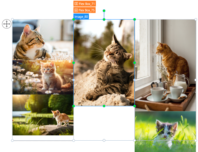
- Select the first flex box, change the Width and Height to %, Width to 30%, Grow to 0, Right Margin to 15. Do the same for the second and the third flex boxes but you don’t need to set the right margin to the third one.
- Select each image in the first flex box, in the Flex Child section in the Properties pane. Change the Lock Aspect Ratio to None, Bottom Margin to 15. Note that the third image doesn’t need the margin setting.
- Select the image in the second flex box, change the Lock Aspect Ratio to None, Width to 100% and Height to 70%.
- Select the first image in the third flex box, change the Lock Aspect Ratio to None, Height to 80%, Bottom Margin to 15. Also, change the Lock Aspect Ratio of the second image to None.
And here is what we got:
Exclude Objects from Container Layout
In the Flex layout, the Container Snapping mode will be enabled by default. In other words, when you move objects into a flex container layout, objects will be automatically snapped to that layout (the flex box turns orange). But you can exclude any objects from the container layout. After that, you are free to place them anywhere on the slide. To exclude any object from the flex container layout, you need to select it first, then:
- If an object is outside the flex container layout, you can right-click it, and select Exclude from Container Layout. Alternatively, navigate to the object’s Properties pane > Size & Properties > Transform > Exclude from Container Layout.
- If an object is already inside the flex container layout, you right-click it and select Group > Remove from Group.
Note: You can temporarily disable the snap behavior by holding down ALT while moving objects. Or turn off this mode by clicking the View tab, then select Container Snapping.
Flex Box Tips
- In some browsers, for example, Safari, the height using percentage is not working very well, therefore, try to use grow/shrink if you can.
- As mentioned above, flex box deals with the layout in one dimension at a time. Therefore, if you want to create a two-dimensional layout, you can nest a flex container inside another one (which is known as a nested flexbox).
- The Auto unit may cause the width or height of objects to be 0, which may be quite hard to edit. In this case, you can fix object size by pixel and then change it to Auto later.
- If you want to separate a container into equal parts, change the flex child width/height to 0% then adjust the Grow property as you want.
So, you’ve walked through a typical case of flex box. And, don’t forget to Download ActivePresenter 9 and start creating your very own project using flex box to boost your performance.

See Also: