Not sure which colors combine together that can help your design be more delightful? Check out this article to receive ideas for the best color combinations.
Our lives could be vivid thanks to color, and so does your presentation. Regardless of designing platforms where you can use ready-made templates, like PowerPoint, Prezi, Canva, or more, or powerful authoring tools like ActivePresenter or Articulate, it is imperative to draw attention to color. Obviously, the way you combine colors could reflect your style, convey the messages you want, and affect your audience’s mood. At first, you select your favorite color as the background, then choose another color to highlight the text. It appears to be easy as a piece of cake, but you end up wasting a huge amount of time picking out a suitable color. Therefore, to reduce your time and effort, we would provide the best 6 color combinations for practical use.
- Monochromatic combination
- Complementary combination
- Analogous combination
- Split complementary combination
- Triadic combination
- Tetradic combination
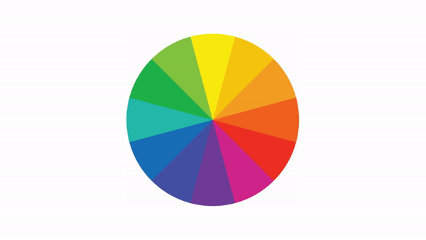
For whom may not know, this is the color wheel combinations – the origin of color theory as we mainly use it to demonstrate the color theory. In all, there are 12 colors in the color wheel classified into 3 categories:
- Primary color (Red – Yellow – Blue),
- Secondary color (Orange – Green – Purple)
- Tertiary colors (Red-Orange, Yellow-Orange, Yellow-Green, Blue-Green, Blue-Purple, Red-Purple), are formed by mixing a primary color with secondary color respectively.
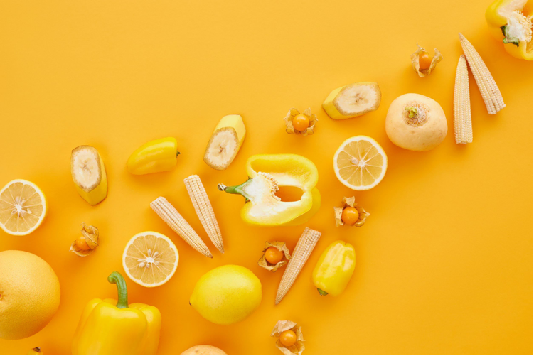
Colors That Go Well Together #1: Monochromatic Colors
Firstly, we go through the basic combination. As the word represents itself, “mono” means “one”. For so, monochromatic picks a single color in the color wheel. Though you only choose one color, for example, purple, you could create a color palette by adjusting the opacity or transparency. In doing so, we are able to produce color shades at ease without fearing messing up the visual layout.

When to use:
- Generate a simple and soothing outlook.
- Design a particular theme without using multicolors.
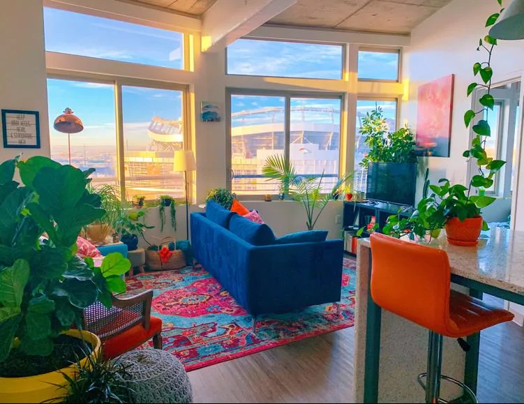
Colors That Go Well Together #2: Complementary Colors
In case you want to make the presentation noticeable, give it a try with complementary colors. This pair is formed by combining warm color with cool color opposite in the color wheel together. Therefore, it will look brighter than any other pair. Try to avoid manipulating or over-use the colors, otherwise, it would cause unpleasant feelings for viewers.
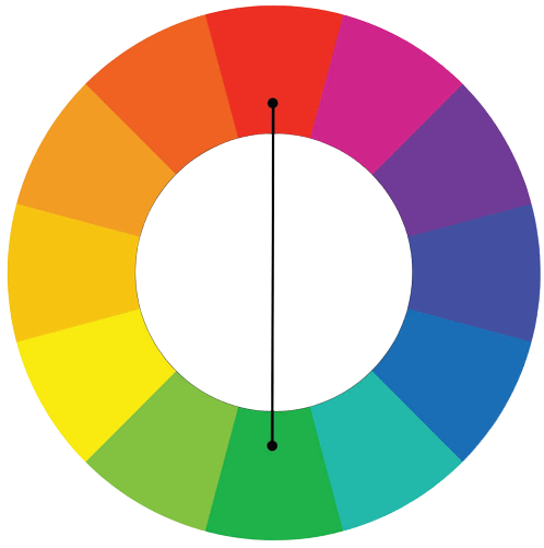 | Sample combinations: Red + Green, Orange + Blue Yellow + Purple, Red-orange + Blue-green. |
When to use:
- Create stunning attention to catch viewers’ eyes.
- Emphasize and highlight an object (text, shape, or image).

Orange, Blue Color Combination by Unsplash
Colors That Go Well Together #3: Analogous Colors
Next, analogous combinations pick colors that sit next to others on the color wheel and combine them together. Take any color that you prefer, then select the right and left neighbor. The first color you choose would be the main color while the other 2 colors are supporting ones. By doing so, you could tone up your design by mixing them with different ratios.
 | Sample combinations: red + purple + red-purple, blue + green + blue-green red + orange + red-orange, yellow + orange + yellow-orange |
When to use:
- Create a seamless and harmonious color palette.
- Place an eye-pleasant and tranquil effect on your presentation.
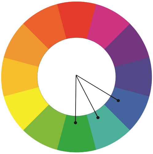
Colors That Go Well Together #4: Split Complementary Colors
Following, split complementary is the variation of the complementary color above. Rather than linking with the opposite color, this color palette connects with the other 2 colors next by. This kind of combination is a safer choice since it could harmonize three colors.
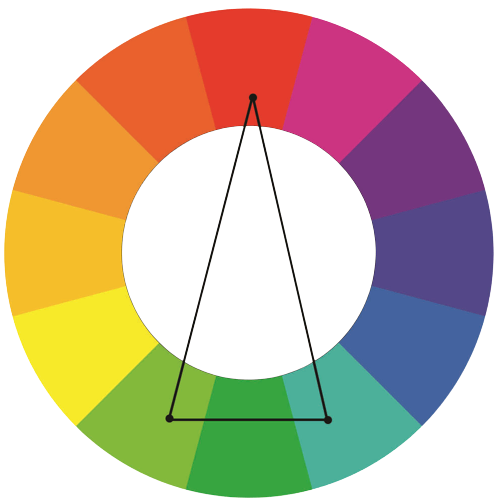 | Sample combinations: orange + blue-purple + blue-green blue + red-orange + yellow-orange red + blue-green + yellow-green. |
When to use:
- Highlight for contrast purposes.
- Create energetic color palettes.
Colors That Go Well Together #5: Triadic Colors
To easily understand, the triadic color scheme includes colors equally distant from each other to form an equilateral triangle on the color wheel. These colors go well together for brands because it helps to raise brand recognition. When applying, we recommend using one color as the dominant color, and the other two as supporting colors. After that, combine them up with a different percentage of cover to create an impressive color scheme.
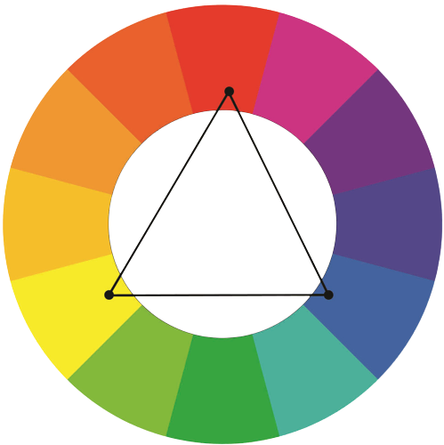 | Sample combinations: purple + green + orange, red + yellow + blue Blue-purple + red-orange + yellow-green. |
When to use:
- Create an eye-catching and cheerful presentation.
- Express a lively and optimistic message.

For example, this image applies a color combination of yellow, red, and blue with unequal ratios. Yellow is the main color in this color group with supporting colors – red and blue.
Colors That Go Well Together #6: Tetradic Colors
This is one of the most complicated color combinations because it requires designers to use carefully. This color design method uses double complementary colors mixed together, that is, double the contrast color pairs. We have to handle these colors carefully, otherwise, it could cause an eye-shocking effect and visual annoyance to viewers.
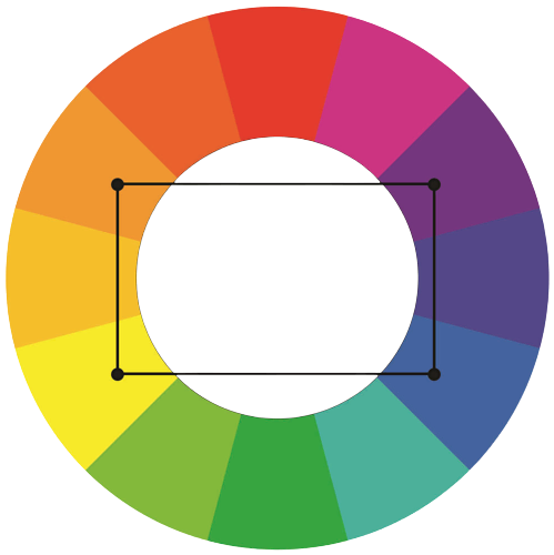 | Sample combinations: Red + orange + blue + green Yellow + orange + purple + blue Red-purple + red-orange + yellow-green + blue-green. |
When to use:
- Catch viewers’ eyes on strong bold contrast color pairs.
- Express the vibrant and unique style of your designs.

Apply Color Combinations in ActivePresenter
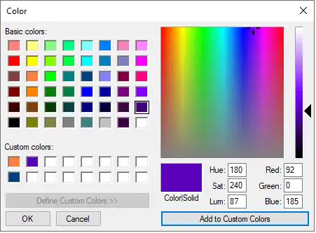
ActivePresenter provides you with color effects to use easily. By using the colors going well together, you could also apply in ActivePresenter effortlessly. Moreover, you can save and add new colors in custom colors as presented in the picture. Scroll the mouse pointer in the color scale until finding your preferred one. After that, click Add to Custom colors for later use. Note that you are able to save up to 16 colors. When exceeds 16, the latest color would replace the current saved one in turn. In order to reduce repeating actions, use Eyedropper to extract the available color. In case you prefer to know more about color applications in ActivePresenter, this tutorial is suitable for you.
Final Words
After all, you could fascinate your audience and convey your messages precisely by understanding how colors combine together. Thus, we do hope that these best color combinations may help you beautify your design like a true artist.
See more:
How to Work with Theme Colors in ActivePresenter 8
The Art of Using Fonts in eLearning Design
4 Places to Find out the Best Website Color Scheme Generator