When designing eLearning courses, sometimes, you may need to use checkboxes and radio buttons. These two interaction objects allow users to select one or more options from a predefined list. Let’s learn how to work with them in ActivePresenter 9.
This tutorials covers:
- Insert Checkboxes/Radio Buttons
- Customize Checkboxes/Radio Buttons
- Insert and Customize Feedback Messages
- Work with Multiple States
- Add Events – Actions
Insert Checkboxes/Radio Buttons
Do as follows to insert one:
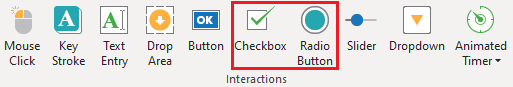
- Open the Home tab > Interactions or Insert tab > Checkbox/Radio Button.
- Click anywhere on the Canvas, or hold and drag the mouse cursor on the Canvas then release it.
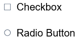
Then, these objects will appear on the Canvas with the default text like this:
Click on the default text to enter a new text. Besides, you can format text attributes such as font, paragraph settings, alignment, and indentation.
Customize Checkboxes/Radio Buttons
The newly inserted object appears with the default format. Its color may be different depending on the theme color. However, you can change it if you want. The Format tab provides you with many properties to customize:
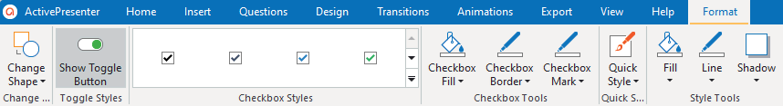
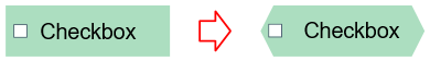
- Change Shape: Change the shape their shape.
- Show Toggle Button: Show or hide the toggle buttons. This option is on by default. If you turn it off, the Checkbox Styles/Radio Styles and Checkbox Tools/Radio Tools will be not available.
- Change its styles: Click on the bottom arrow to display the Checkbox Styles/Radio Styles gallery and select the new style that you want.
- Change colors: Click the corresponding options in the Checkbox Tools or Radio Tools section to change the background, border or mark color.
You can set the customized checkbox/radio button as the default one. In this way, the newly added object will inherit the changes. To do that, right-click it > Set as Default Checkbox/Set as Default Radio Button.
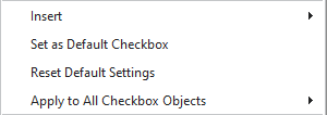
On the other hand, if you want to apply the changes to all existing ones in that project, right-click it > Apply to All Checkbox Objects/Apply to All Radio Button Objects > Style.
Work with Multiple States
A checkbox/radio button object comes with 8 built-in states. They control its look when users interact with it.
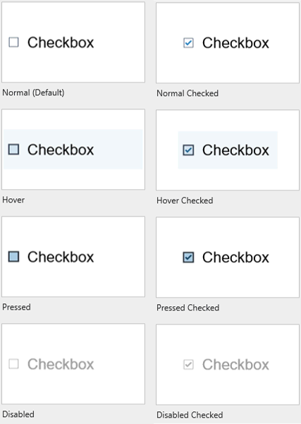
- Normal (Default): This is the initial state when it first appears in the output.
- Hover: The state when users hover the mouse over it.
- Pressed: The state when users click on it.
- Disabled: The state when it is disabled. In this state, it is still visible to users, but they cannot interact with it.
- Normal Checked, Hover Checked, Press Checked, Disabled Checked: These are the states of selected checkboxes or radio buttons.
You can customize those built-in states or add more states if necessary.
For more information, see How to Change States of Objects.
Insert and Customize Feedback Messages
You can add two feedback messages to a checkbox/radio button. They are Timeout Message and Hint Message:
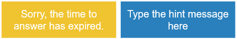
- Timeout Message will appear when users don’t complete an action in the predefined time.
- Hint Message will appear when users hover the mouse over it.
To add a message, open the Questions tab > Message > Timeout Message/Hint Message. Or, right-click the checkbox/radio button object > Insert > Timeout Message/Hint Message.
After that, you can customize feedback messages as you wish.
For more information, please refer to How to work with Feedback Messages.
Add Events – Actions
Unlike some interactive objects, these objects don’t have default events – actions. But if you add feedback messages to them, ActivePresenter 9 will automatically add events – actions to make the message shown in the output.
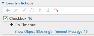
Besides, you can add new events – actions to make them interactive the way you want. To do that, select it > Properties pane > Interactivity > Events – Actions > click the plus button and select an event.
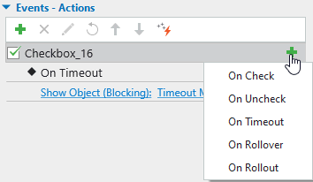
- On Uncheck: Occur when users uncheck it.
- On Check: Occur when users check it.
- On Timeout: Occur when users don’t respond within the specified time.
- On Rollover: Occur when the mouse rolls over it.
- On Rollout: Occur when the mouse rolls out of it.
Then, continue adding actions to the events, and conditions to each action if necessary.
For more details, see Work with Events – Actions.
That’s how to insert and customize checkboxes and radio buttons in ActivePresenter 9. Download ActivePresenter and make your course more interactive.

Besides, follow our Tutorials page and YouTube channel for more helpful articles and videos.
See more: